[embedit snippet=”adversal5″]
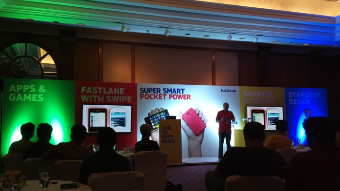
So, we got a chance to play with cute, pocket-friendly (Budget and size) wise Asha 501 during Nokia India’s blogger’s event. We manged to capture couple of images with its camera and also made hands-on videos of its “Swipe” UI and cool features. Click the below link for watching the hands-on videos of Asha 501.
Coming to our first impressions of the device and its “Asha” UI, here is what we felt,
- The device looks damn pretty in the colors and is very pocket-able.
- For the price of 88 USD in India, it simply looks and feels unbeatable.
- The swipe based UI navigation and 2 home-screens “Fastlane and Apps” concept is very intuitive and stylish at the same time. The UI instantly reminds one of Nokia N9′s UI with “Swipe” navigation and “Fastlane” is really very neat and innovative. So, you have two homes screens, Fastlane , where you have all the recently opened apps listed and you can access them when you want and swipe and you get the apps icon home screen. From, any open apps, swiping to right takes you back to the home. Really, cool way of multitasking and navigating through the UI!!
- Through our hands-on the device navigation was lag-free and apps were opening really fast.
- It was really sweet to see “Glance screen” and “Double tap to wake up” features on the Asha 501. Mind you, the much pricier Lumias will get these features only with next OS update in July-August.
- The camera UI is simple but still easy to use. Clicked images can be accessed from the camera UI itself by clicking icon similar to 808 PureView.
- Imaging quality is really good for a 88 USD pricing phone. Check two of the image samples below.
[embedit snippet=”adversal-3″]
Stay tuned for full review and much more detailed coverage when we get the review unit!! Also, it seem the first stock of Asha 501 will hit stores this week.
[embedit snippet=”adversal5″]


![How to turn on & off Safe Mode on Android [Video] & what can you do in Safe Mode](https://i0.wp.com/nokiapoweruser.com/wp-content/uploads/2021/02/Android-Safe-mode-how-to-video.png?resize=80%2C60&ssl=1)

