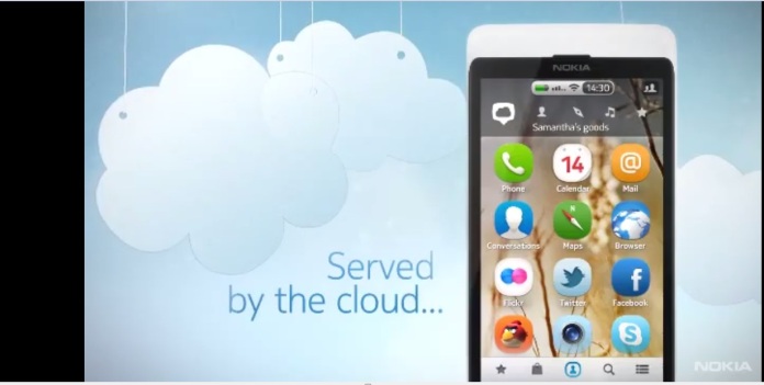
Look at the above screenshot from the leaked “Nokia Air” video. The news item “Angry Birds nets 50 million download” is dated 26th Dec 2010. Around the time when I bought my N8:). So, now it seems that this was future roadmap for Nokia in “pre-windows phone” days. Perhaps it has nothing to do with Meltemi then, but rather it was the Nokia’s smartphone startegy which was later shelved by Nokia’s present management. Oouch !!
Can anyone imagine Nokia was readying such an elegant looking and futuristic eco-system. A cloud service named “Nokia Air” and devices with cool looking icons and widgets syncing with cloud and getting latest updates and notifications directly delivered to device’s screen. The video mentions a truly radical eco-system where there are,
- No Menus for the apps store.
- Notification come directly to the top small “notification bar” and as pull down extended notification bar.
- Most updated version of application directly delivered to device by cloud as there in no need for download.
Now coming to the demoed OS bit. All the devices shown are buttonless and there seems to be 5 different home screens one each for separate fuctions. Check the screenshot below. First home screen is for Apps, second for centralised (Contacts + social Feeds). Third is for latest updates and videos and so on. The mode of navigation across the homescreens is obviously “Swipe”. Though there are Symbian “Widgets” as well.
It seems to be the predecessor design of N9’s buttonless form and three swipable home screen Meego-Harmattan OS.
Catch the full video below,
[youtube=http://www.youtube.com/watch?v=pBYHxNEMVh8&feature=player_embedded]


![How to turn on & off Safe Mode on Android [Video] & what can you do in Safe Mode](https://i0.wp.com/nokiapoweruser.com/wp-content/uploads/2021/02/Android-Safe-mode-how-to-video.png?resize=80%2C60&ssl=1)

