

If your Android home screen looks just a little sleeker today, your eyes aren’t deceiving you. Google has quietly started rolling out a subtle visual refresh across its core suite of communication tools—Google Messages, Phone by Google, and Google Contacts.
Rather than overhaul its apps with radical redesigns, Google is focusing on the finer details. The new look brings cleaner edges, updated curves, and consistent color palettes featuring subtle gradients that match recent visual updates seen across the rest of the Google app ecosystem.
Android journalist Mishaal Rahman brought attention to the subtle refresh, pointing out how the crisp linework and updated gradient shading give these everyday utility apps a more cohesive, modern feel.
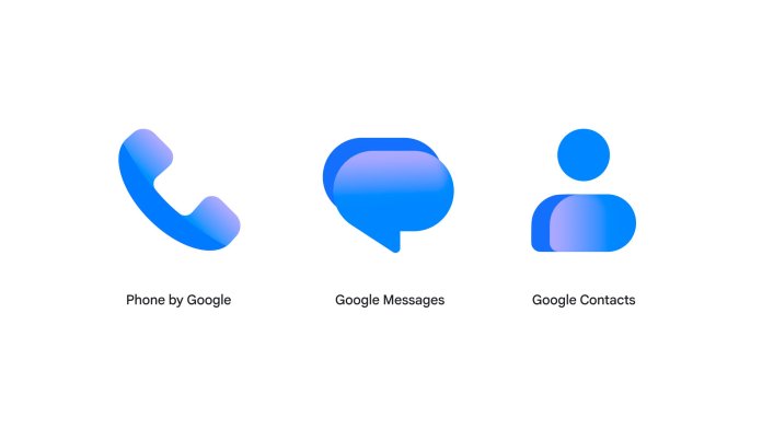
What’s Changing in the Icon Refresh?
At first glance, the changes might seem minimal, but side-by-side comparison reveals a clear design shift away from flat, single-tone fills toward depth and dimension:
Subtle Gradients: The iconic flat blue, green, and multi-colored blocks are receiving soft lighting transitions, giving each icon a gentle 3D feel without clutter.
Refined Geometry: Curves have been smoothed out and outer edges sharpened for better clarity on high-density displays.
Cross-App Consistency: The update unifies color tones across Messages, Phone, and Contacts, ensuring they feel like a tightly integrated family rather than separate utilities.
Beta testers were among the first to catch the changes across both smartphone displays and Wear OS smartwatches, with early before-and-after screenshots sparking friendly design debates across developer forums and social channels.
This aligns closely with Google’s broader design direction, as seen in previous UI shifts like the Google Workspace gradient icon redesign and earlier server-side tweaks such as the Google Pixel app icons update.
Purely Visual: What It Means for Users
While design tweaks always draw strong opinions from tech enthusiasts, Google has confirmed that no functionality changes accompany this visual refresh.
Your chat histories, contact cards, call logs, and feature sets remain completely untouched. The update is strictly aesthetic, driven by user feedback to create a cleaner visual hierarchy across Android’s default app suite.
The updated icons are rolling out gradually via the Google Play Store over the coming weeks. If you haven’t seen the new gradients on your phone or smartwatch yet, keeping your core Google apps updated will bring the fresh look to your device soon.
To dive deeper into system UI upgrades, feature deep dives, and core app enhancements, explore our detailed analysis of Android 17 features on NPoweruser as well as the latest breakdown of the Google Pixel Drop features.


